The Payment Hall of Shame
Most merchants don't think of design as part of payment processing until they see it done wrong. A poor checkout can undo all the marketing effort that brought a customer there. Let's look at some great classic examples of bad payment processes I have encountered so far.
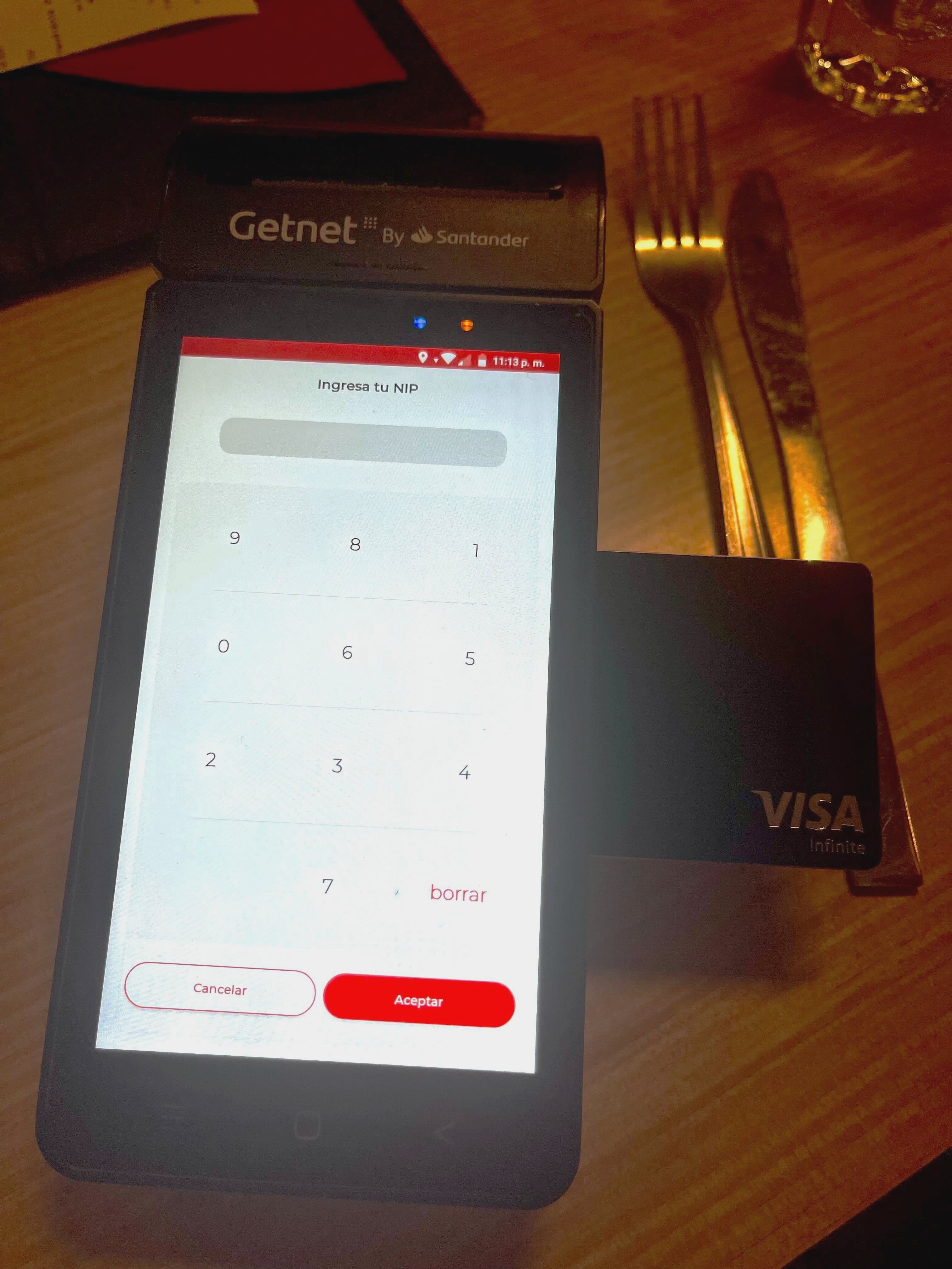
The Shifting PIN Screen
A security feature gone rogue. Randomized keypads may stop shoulder-surfers, but they also break muscle memory and patience. When people fail to enter their PIN three times, it's not fraud prevention — it's friction. Look at the image below... would you be able to type your PIN in seconds or would you need to hope for the right PIN entry?

Who thought this was a good idea? If I, as a payment expert, had to giggle, I can only imagine how many grandmas nearly had a heart attack trying to pay. And I'd love to see the faces of those who approved it in usability testing — assuming such testing ever existed.
The Checkout Time Machine
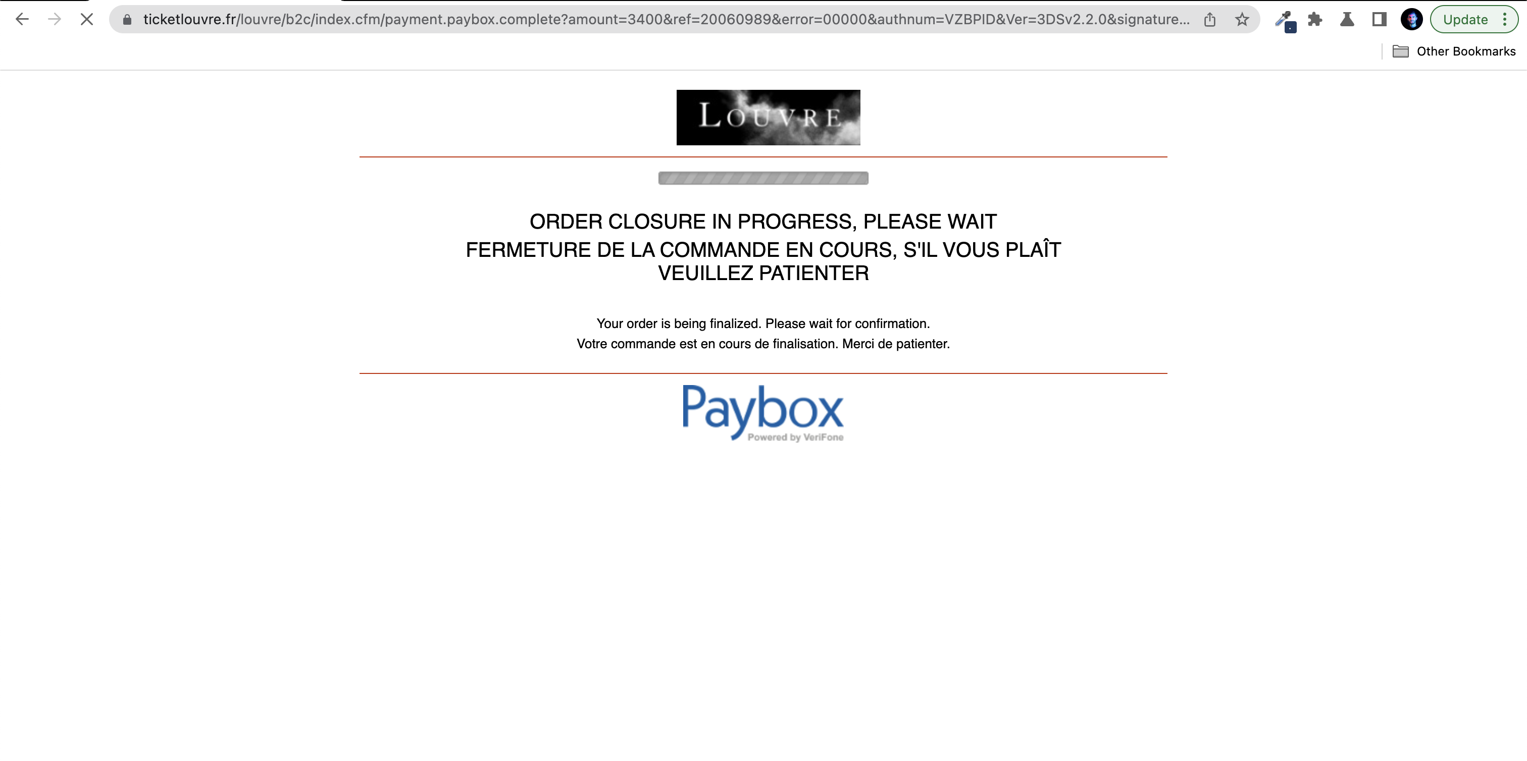
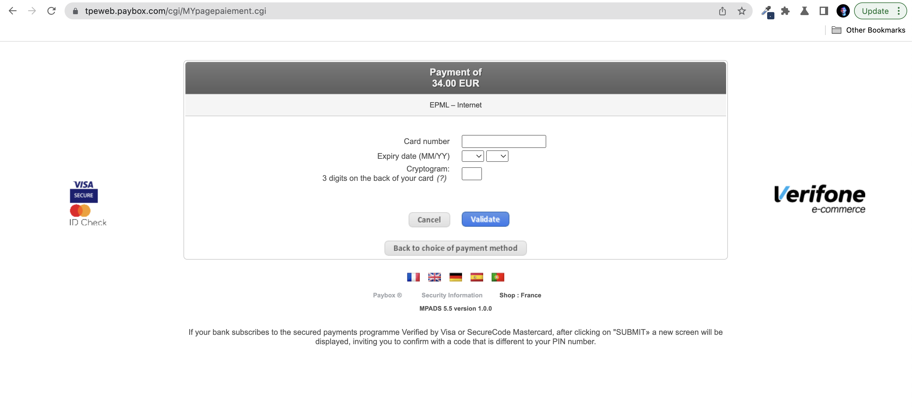
Some legacy pages still look straight out of Internet Explorer 6 — grey boxes, serif fonts, and that heart-stopping "PLEASE WAIT – DO NOT CLOSE THIS PAGE". Merchants sticking with these relics often pay the price in abandoned carts and lost credibility.


To be fair, these designs did work once. Back in the early days of e-commerce, people were grateful if the page didn't crash halfway through. And closing the page did indeed mean you lost your cart or got double charged. But times changed. And yet, some gateways still make you select your card type before typing your number, as if the system can't figure it out itself. Payment optimization? Apparently optional.
Even major institutions aren't immune. The Louvre's payment page was a perfect example of how not to do it. It felt like stepping back twenty years in time: clunky forms, unclear progress states, and that anxious "don't touch anything" energy. They may have updated it by now (I genuinely hope so), but it was such a surprisingly poor experience that I had to screenshot it during my purchase. France has long trailed behind in digital UX. Hopefully, by the time I'm back, they'll have caught up.
Updating payment design is never easy. Compliance, legacy systems, and scheme certifications slow everything down. But if you're a merchant with the ability to modernize your checkout, please do. Everyone — including your conversion rate — will thank you.
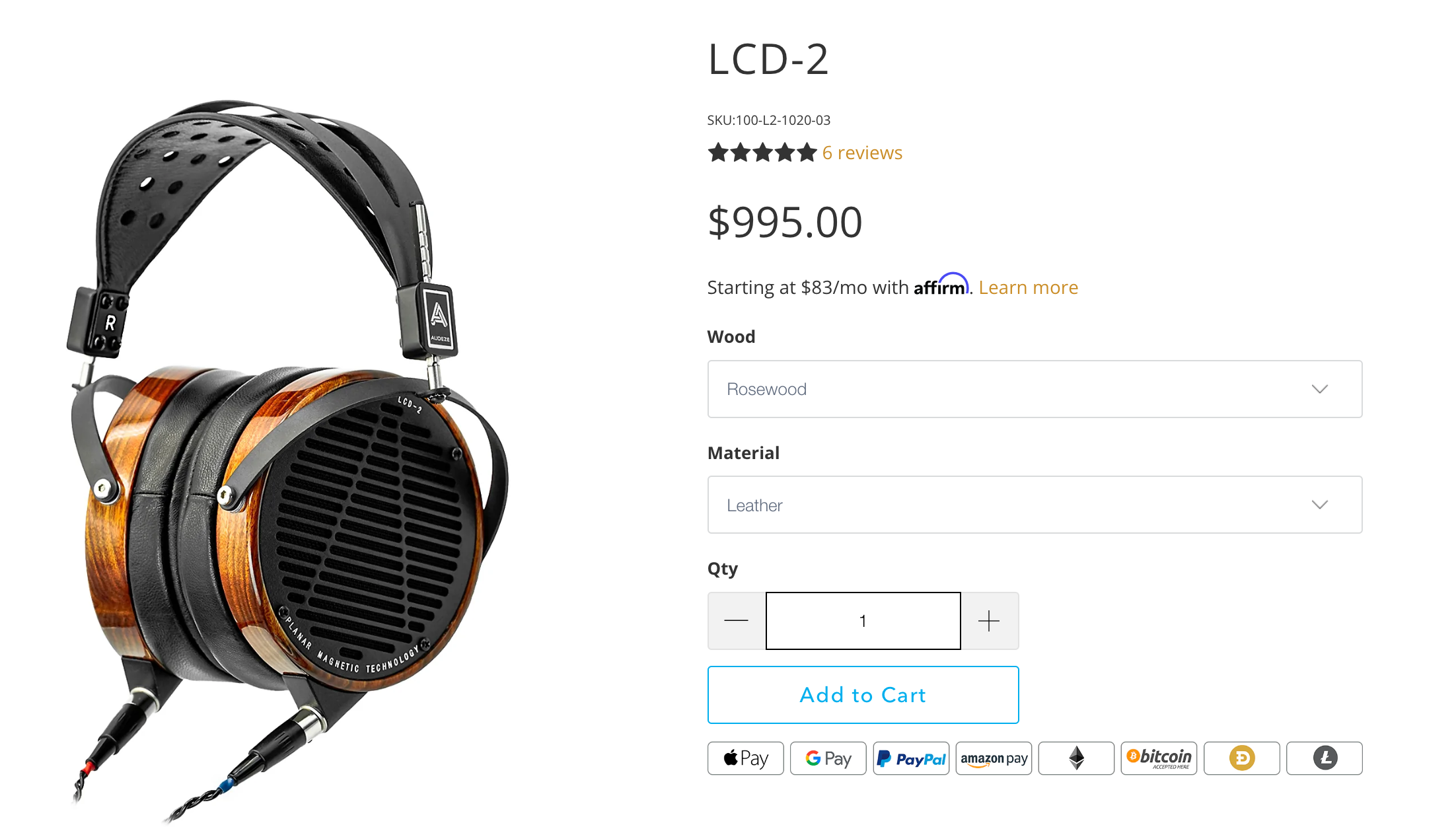
We Accept Everything
A checkout plastered with every logo known to humanity — Visa, PayPal, Dogecoin, loyalty points, supermarket coupons — might look impressive, but it screams confusion, not confidence. Good design curates; it doesn't clutter.

And yes, nothing says "trust us" like a 90s-era banner shouting "Secure payment by [insert random provider]". I'm glad those are mostly gone. As a rule: focus on the payment methods your customers actually use. Not every shiny logo needs a place on your checkout page. Seeing merchants cram in a hundred options instead of optimizing three still makes me furious — because it's the opposite of what drives performance.
For merchants, these examples are cautionary tales. The right provider helps avoid such pitfalls by offering flexible, branded checkout options, continuous UX testing, and modern frameworks that adapt to devices and regions instead of fighting them.
If you've made it this far, remember: we're all consumers too. Every payment expert has fumbled through a terrible checkout, cursed at a frozen terminal, or stared at a "please wait" spinner that never ends. The Payment Hall of Shame isn't about laughing at others — it's a reminder of how fragile payment experiences become when design, regulation, and technology stop talking to each other.
As consumers, we notice every extra click and confusing prompt. As professionals, we can fix them. Payment experiences don't have to be ugly or stressful; they just need the same care and curiosity that we already give to everything else that touches a customer.
